COLOUR PALETTE: 2023 EDITION

THE TRENDING COLOURS FOR 2023 ARE ALL ABOUT CREATING A COMFORTING HOME.
Industry experts have made their picks for the upcoming year, and the palette is full of rich and restorative colours tinged with natural warmth. From classic neutrals to earth tones to vintage-inspired hues, each colour in the collection has the ability to envelope a room like a comforting embrace.
“As we look to the future, we see two emerging paths that while completely diverse, are inevitably interconnected,” says Leatrice Eiseman, Executive Director of the Pantone Colour Institute. “This intense dichotomy comes through in our colour choices for Autumn/Winter 2022/2023 where we see bold and brash colours that lend themselves to exaggerated statements reflecting our desire to embrace life with full vigour, coalescing with an array of neutral and natural tones that embody a sense of calm and containment and satisfy our need for harmony and tranquillity.”
So on the one hand, we’re gravitating towards calming neutrals with warmer yellow hues – and on the other, we’re immersing ourselves in vivid and optimistic colour like WGSN’s Digital Lavender, Pantone’s Viva Magenta and Benjamin Moore’s Raspberry Blush. Thankfully our homes can cater to both, and quite a lot in between.
See below for The Textile Company’s colours to look out for in the coming year.
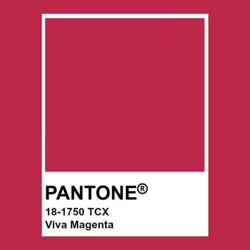
VIVA MAGENTA
Pantone’s Colour of the Year, Viva Magenta 18-1750, vibrates with vim and vigour. It is a shade rooted in nature descending from the red family and expressive of a new signal of strength. Viva Magenta is brave and fearless, and a pulsating colour whose exuberance promotes a joyous and optimistic celebration, writing a new narrative.
This year’s Colour of the Year is powerful and empowering. It is a new animated red that revels in pure joy, encouraging experimentation and self-expression without restraint, an electrifying, and a boundaryless shade that is manifesting as a stand-out statement. PANTONE 18-1750 Viva Magenta welcomes anyone and everyone with the same verve for life and rebellious spirit. It is a colour that is audacious, full of wit and inclusive
Designer: Kennedy Nolan | Image: Derek Swalwell
ULTRAMARINE
Derived from the lapis lazuli stone, the Ultramarine pigment was considered more precious than gold. For centuries, the lone source of ultramarine was an arid strip of mountains in northern Afghanistan.
Blue comes into colour trends every year, just taking a slightly different form. It’s such a grounding and familiar colour that there’s so surprise we are drawn to it year after year, and this year it’s deep blues that are looking to be the most on-trend. It’s about really embracing the darker shades, not just bringing it into a neutral space with furniture, or a feature wall but going all over with an inky shade to create a dramatic and cocooning room.
WARM YELLOW
Yellow – as any colour – comes in many different shades. From the very light pastel yellow to a deep ochre yellow, it is the warm tones that are popping up more frequently in homes around the world.
These deep and rich colours add a warm and slightly earthy tone to a room. A warm yellow is also very versatile; in modern homes, it adds warmth and colour. And for period homes it enhances the historic feeling of the home as it’s a shade that has been used in homes for centuries.
Lookofsky Architecture
DIMORE Studio
OCRE/RUST
If you are ready to turn down the summer heat and usher in some fresh fall vibes, then it is time to layer in lovely shades of rust to help you out! With so many people leaning towards neutral, organic palettes these days, rust is just the ticket to spice up any space. For such bold colour, it has a peaceful, calming effect that also lends to a stylish, retro appeal. It feels like a throwback, but stars as a comeback. We don’t often pair words like luxurious and earthy or sophisticated and cosy, but this colour captures the essence of every aspect combined into one stunning hue.
It’s versatility and star quality, whether elegantly layered into a soft, soothing aesthetic, or perfectly placed as a focal point, catches the eye and demands attention. However it is applied in design, rust holds its own as a statement colour, and the result is both gorgeous and wonderfully grounding.
JADE GREEN
Green is an extremely positive hue as it stimulates thoughts of balance, growth and restoration in colour psychology. It immediately brings the natural world to mind and it’s an incredible way to bring a refreshing sense of nature indoors, especially if your home is located in a city with little surrounding greenery.
Jade, is essentially tangible hope; a precious substance born under pressure and the celebration of resilience. A colour for every room; no matter where it is applied, jade flows around a space to transmit a sense of peace and calm that not all colours have. Use it through decorative pieces, comfort zones, and especially for coverings, like rugs and wallpapers.
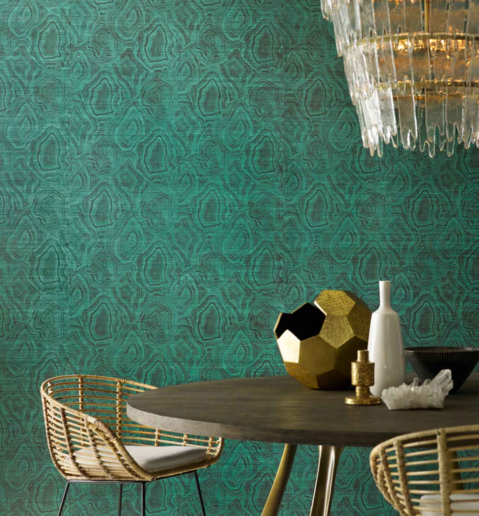
Phillip Jeffries 5937
Photography is by Inna Kablukova
LAVENDER
Following on from Pantone’s 2022 Colour of The Year Very Peri, Lavender is set to continue purple’s dominance within the interiors sector. Often associated with royalty and tradition, purple is perfect for adding drama and character to a room. Lavender and heather shades, which conjure the beauty of nature, are perfect for relaxing spaces. Bringing a touch of colour without overwhelming a room, these delicate purples make a great backdrop for decorating with colourful furniture, homewares and artwork.
Lavender may not be the first colour you reach for when decorating your home, but there are so many reasons you shouldn’t write it off.